

Our favourite examples of creative and iconic billboards
When you think about billboards, iconic sites like Times Square and Piccadilly Circus probably spring to mind. But these sites would be nothing without the creatives they display. So, what makes one billboard more iconic than the next?
From the copy to the design to the targeting, everything comes down to how effectively you communicate with your audience. Incredible visual effects might make one billboard stand out from the crowd, while clever wordplay enables others to leave a lasting impact.
Let’s take a look at some of the best examples of creative and iconic billboards that we’ve seen recently.
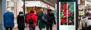
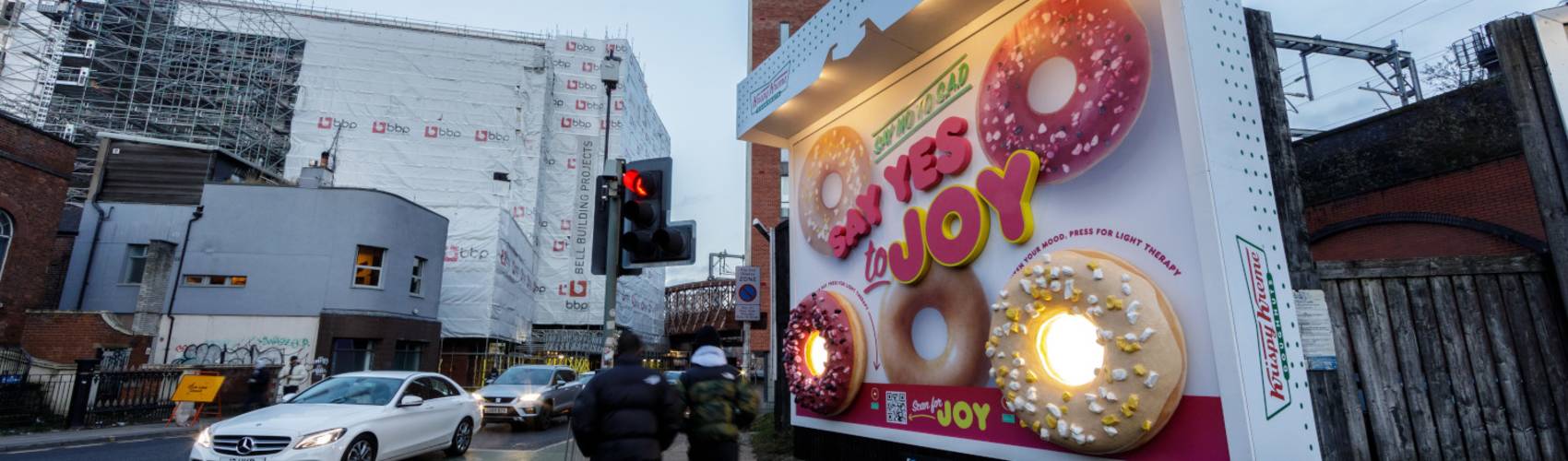
Krispy Kreme
Krispy Kreme wanted to bring joy to the residents of Salford who, during January, experience an average of just two hours of sunlight per day. To do this, they designed a custom billboard that replicated their iconic Krispy Kreme box as a 3D installation. Passers-by could press a button to turn on light-emitting doughnuts, bringing a spark of fun to an otherwise dull January day.
This is an excellent example of how the product itself is sometimes the best advert. Krispy Kreme built their billboard around decades of brand recognition and product adoration. Those battling the January blues were encouraged to say yes to joy of any kind – including everyone’s favourite doughnut.
Simply Roasted
One of the coolest billboards we’ve seen is for Simply Roasted, the line of healthy crisps from food brand Mindful Snacker. As with Krispy Kreme, this special-build billboard plays on the concept of packvertising, featuring giant reconstructions of the crisp packet in two different flavours.
The packaging itself does most of the work. The simple design is easy to digest whether seen from foot or car, and reflects the product’s core USP of ‘less’ (less fat, less salt) with its minimalist logo and colour scheme. But the 3D effect is what truly grabs the eye and with such a simple design, there’s nowhere to hide. The build required an extraordinary level of detail to ensure the finished product was an exact replica of the original, executed to the highest standard.
This iconic billboard was the star of Simply Roasted’s campaign but was supported by static, 2D versions run across various other formats. All placements were located in close proximity to Waitrose supermarkets, where the product was stocked.
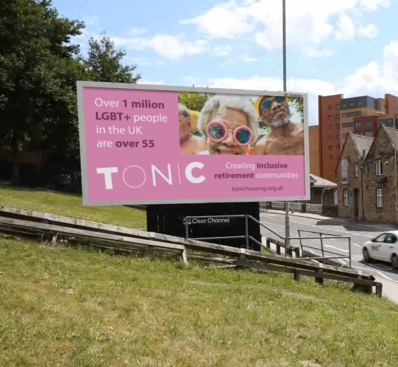
Tonic Housing
Tonic Housing launched in 2022 as the first retirement housing development aimed at LGBT+ individuals. Their campaign was founded on a sense of belonging, as evidenced by their creative billboard design.
The choice of statistic used in the copy – ‘Over 1 million LGBT+ people in the UK are over 55’ – sends the clear message that older LGBT-identifying people are not alone. While a powerful message to any minority group, it’s particularly pertinent in this case; LGBT+ people too often feel isolated and alone, an experience which is amplified by the ageing process. The message resonates even more so because the targeted demographic might have never had the chance to feel part of a community, having grown up in a time when their sexuality was heavily stigmatised.
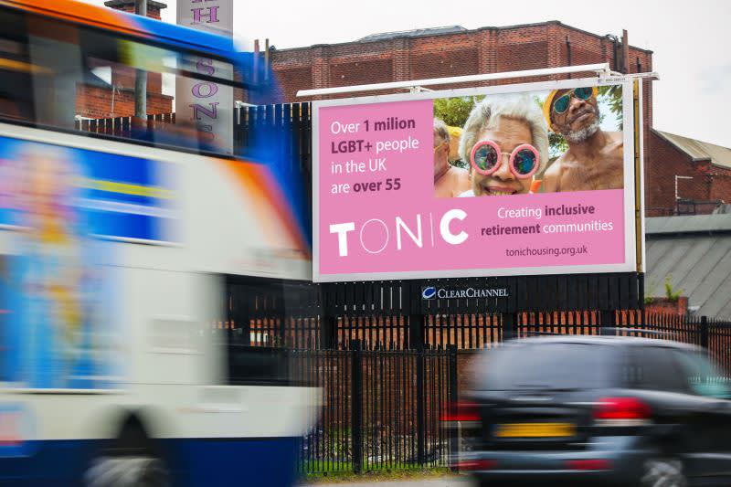
Standing out from the pink background – a reclaimed symbol of LGBT pride – is an attention-grabbing photo. It’s attention-grabbing because it showcases older people as we don’t usually see them: seemingly nude and posing in a youthful style. Warmth emanates from the photo, echoing the copy’s message of ‘creating inclusive retirement communities’.
At first glance, this billboard might not seem as creative as some of the others on this list. But daring to deviate from the temptation to do something ultra-bold is exactly what makes it creative. Tonic have truly considered their audience, who have most likely never used TikTok and could become easily bewildered by too much flashy visual information. Through the use of a more traditional format, Tonic not only avoided this but also proved that they can meet their audience’s needs.
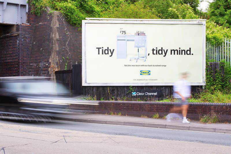
Ikea
Ikea ran a back-to-school campaign in August, drawing heavily on contextual relevance to promote their range of home-study furniture. Aside from the August run dates, Ikea appealed to the public (and specifically parental) conscience at the time – post-pandemic, ensuring that children were able to catch up on missed schooling was a pivotal issue.
Setting up the ideal environment in which to do homework was just one way parents could support their kids. Ikea spoke to this sentiment by playing on the popular phrase, ‘tidy desk, tidy mind’, and rounding off with an uplifting message of hope, ‘nail the new term’.
Visually, the product information and pricing are presented in the same style that Ikea use across all marketing comms: TV adverts, website and even in-store tags. This synchronicity forms an immediately recognisable design, cementing Ikea’s status as one of the most iconic brands in the world.
The last word
Billboard advertising is one of the most popular forms of Out of Home, providing opportunities for brands to innovate and showcase their creativity time and time again. It’s not difficult to feel inspired by some of the most creative billboards out there – we had ideas bubbling just writing this.
If you’re keen to put together a memorable billboard campaign that both excites your customers and aids your bottom line, we’d love to hear from you. Get in touch to find out more about the process.
Start your billboard campaign
Interested in learning more about billboard advertising? Fill in our form and one of our team will be in contact shortly to answer your questions and get started on your next campaign.